There are many types of graphs you can include in your reports once you complete an assessment.
Some the things you can report visually include:
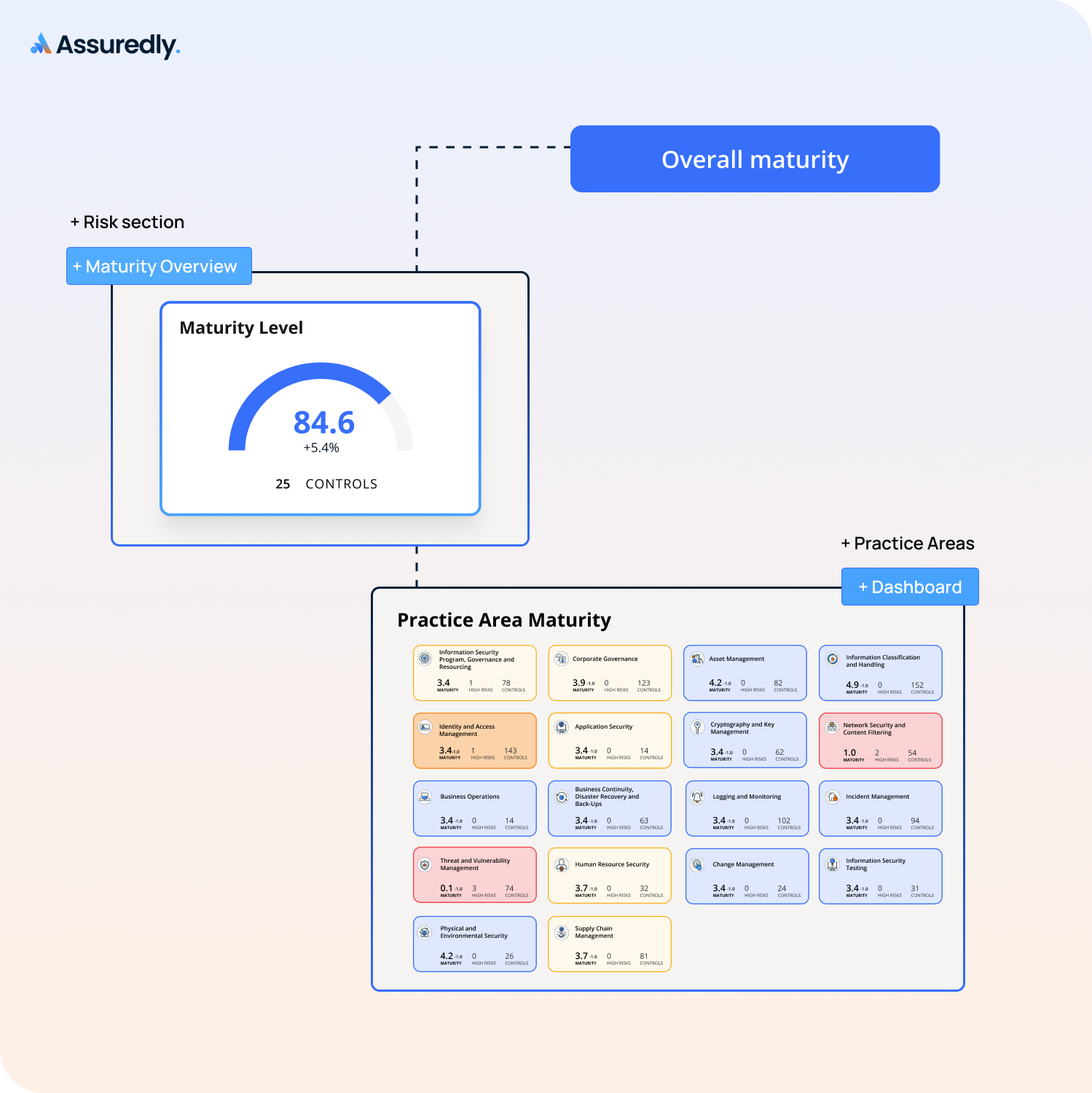
- The Overall Maturity of the assessment.
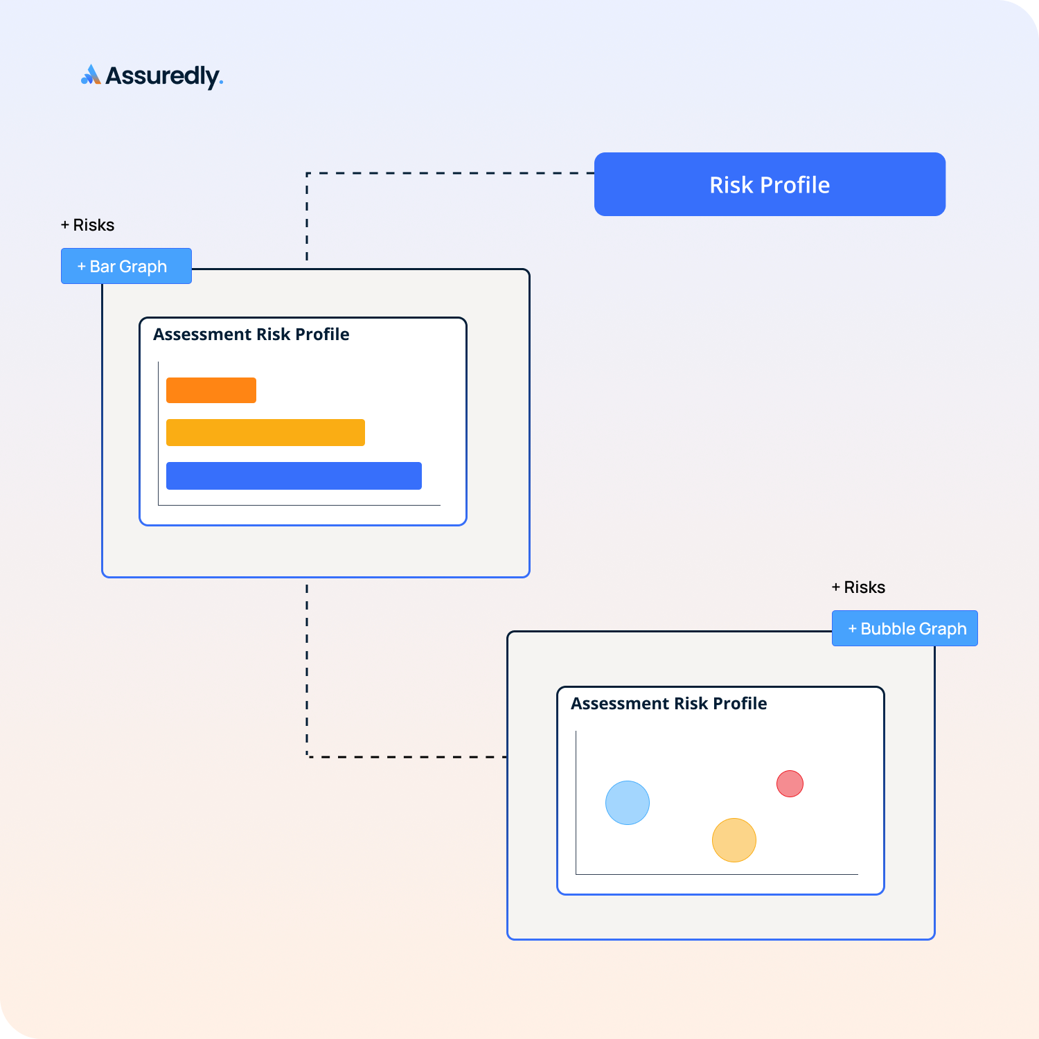
- The volume of and ratings of risks identified from the assessment.
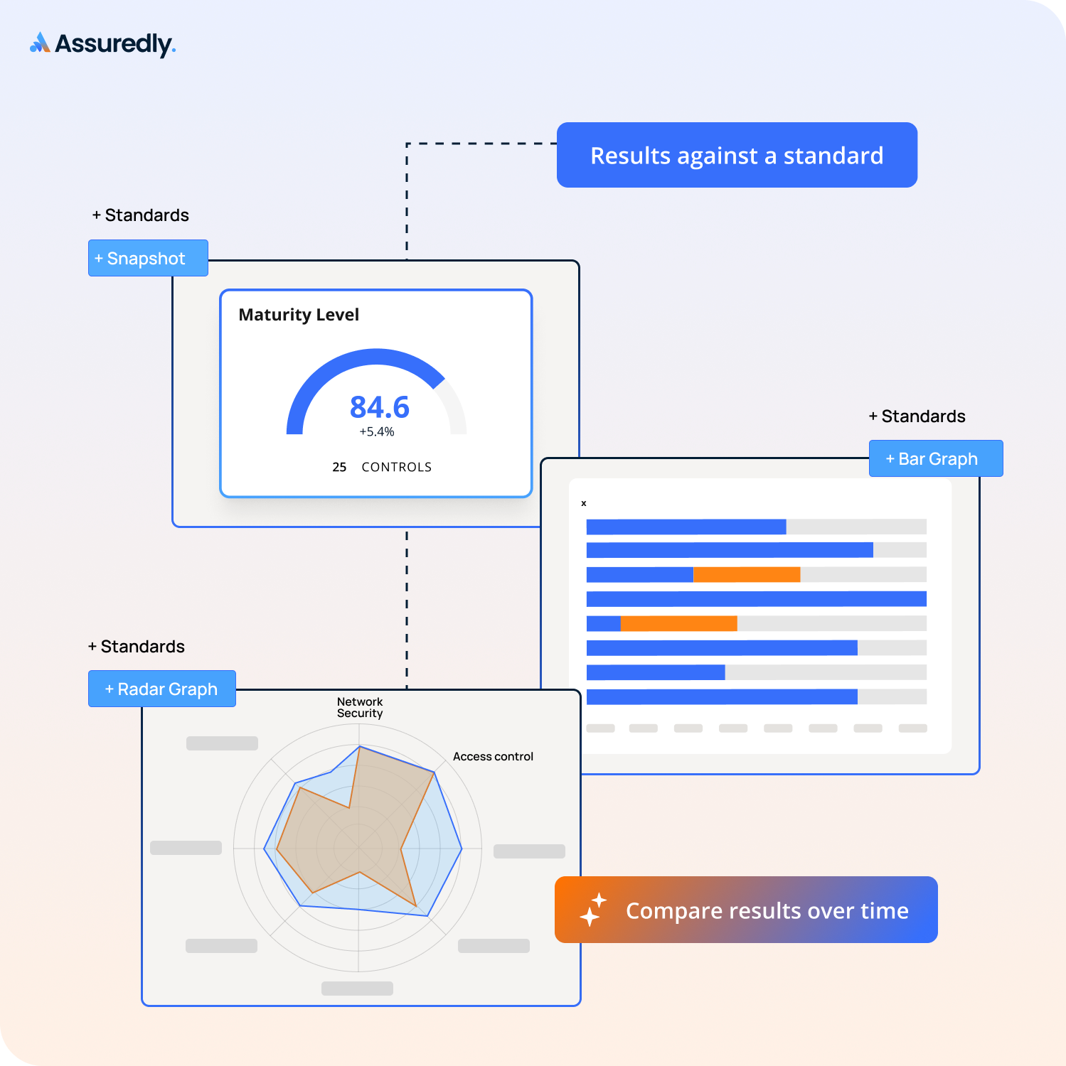
- How the business measured up to an in-scope standard or frameworks.
- How mature controls are across all the categories set by in-scope standards or frameworks.
- How the maturity of controls by standard categories compared over-time.
- The results of an Essential Eight assessment by Maturity Level.
How to add Visual graphics to reports
Select any of the follwing visuals to add to your reports.
Overall Maturity of the assessment
To add a snapshot of the Overall Maturity of the assessment:
- Add Section - Risk
- Add Item - Maturity Overview
Risk Profile
To add a bar graph showing the volume of and ratings of risks identified from the assessment:
- Add Section - Risk
- Add Item - Bar Graph
To add a bubble graph showing the volume of and ratings of risks identified from the assessment:
- Add Section - Risk
- Add Item - Bar Graph
Overall Maturity against a Standard or Framework
To visualise how the business measured up to an in-scope standard or frameworks:
- Add Section - Standards
- Add Item - Snapshot
- Select a Standard
Maturity of Controls by Standards Category
To see how mature controls are across all the categories set by in-scope standards or frameworks:
- Add Section - Standards
- Add Item - Bar Graph
- Select a Standard
Compare Maturity of Controls by Standard Categories Over-Time
To compare the maturity of controls by standard categories over-time:
- Add Section - Standards
- Add Item - Radar Graph
- Select a Standard
- Select another report to compare results with
Graphs for Tiered Standards
To add a bar graph showing the results of an Tiered standard assessment by Maturity Level:
- Add Section - Standards
- Add Item - Bar Graph
- Select the tiered Standard
- Select the Maturity Level
.png)